Journey through the fog

A designer's World Cup picks
The world united through football, yes, and those jerseys! Our favorite teams brought amazing design inspo to the World Cup (even if they left in the quarterfinals).
Norway
The typeface for the Norwegian jersey, Taakeferd Condensed, is based on an ancient runic alphabet (elder futhark). Norway tried to use a more literal version of the alphabet for an earlier jersey, but this year it's simpler, more minimalist, and maybe more effective. It's immediately recognizable while still being readable – you don't have to know what a rune is to know it looks runic.
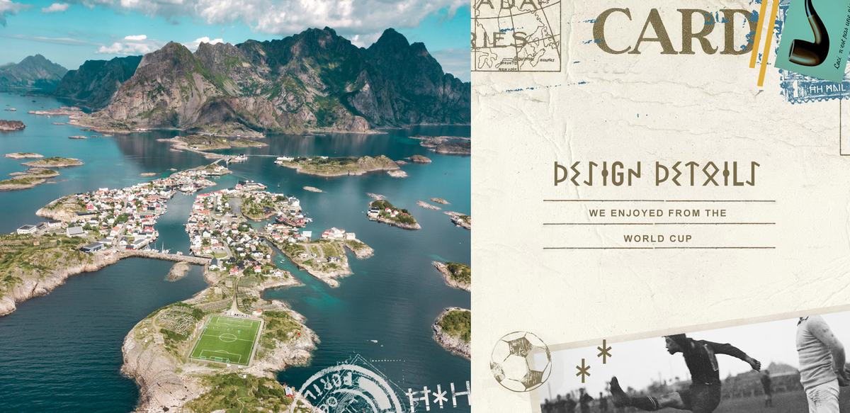
Taakeferd is Norwegian for "journey through the fog." What a beautiful image. Not emerging from, but journeying through. I'll be sitting with this image, in my own foggy journey, long after the World Cup.
Belgium
The Belgian away jerseys are inscribed with "Ceci n'est pas un maillot" (This is not a jersey), an homage to Rene Magritte's "The Treachery of Images" or "Ceci n'est pas un pipe" from 1929. The football kit itself is pink and blue, with no flag colors, and referencing another Magritte painting from 1931 called "Voice of Space."
It doesn't just reference the paintings, but also surrealism. The World Cup is beautiful in it's moments of unguarded unity, and it's also bizarre in its juxtapositions. The politics, emotions, even the logistics all for a game of footie. It's incredible, but also as silly as a man with an apple in front of his face.
"User" vs. "Customer"
It's a really small thing, but at H+H we're mindful to refer to our clients' customers as "customer" and "visitor" instead of "user", popular in software design and development.
While user isn't incorrect, it's not humanizing either. It's reductive and quantifying. Visitors are people, users are stats. People have taste and judgement and confidence; users have behaviors.
The small choices we make in our language are reflected in our design and development, in how we treat our clients, and how our work treats their customers.